Fidelidade
Fidelidade is the largest and most established insurance company in Portugal, with a legacy of trust and innovation spanning decades. As a market leader, it offers a diverse range of insurance solutions across life, health, and non-life segments, continuously evolving to meet the needs of modern consumers.
Challenge
For the past two decades, insurance has been reimagined for the digital world, evolving from simple online communication to complex subscription and management tools. The emergence of digital-native insurance products has led to a new category: fully automated, on-demand insurance.
The biggest Portuguese insurance company, Fidelidade, challenged us to explore strategies for this new paradigm and materialize them into solutions for a mobile-native experience.
Outcome
The outcome of the project was a reimagined approach to on-demand insurance, redefining how people interact with and experience insurance services. This resulted in the development and validation of a Minimum Viable Product (MVP) with a clear value proposition, ensuring an ideal and intuitive user experience tailored to modern digital expectations.
Fidelidade, Portugal's leading insurance provider, tasked us with exploring strategies for the emerging paradigm of fully automated, on-demand insurance. Our collaboration led to the creation of a mobile-native experience that redefined how users engage with insurance services. The result was a Minimum Viable Product (MVP) that validated a clear value proposition.
Our role and goal
Transforming On-Demand Insurance into a Unique Travel Experience
Define a new vision for on-demand insurance, reimagining how it could enhance user experiences and integrate it into a harmonious digital solution. We aimed to understand user behaviors, fears, and perceptions of on-demand services and translate these insights into a validated Minimum Viable Product (MVP).
To achieve this, we conducted in-depth research to analyze how users engage with insurance and on-demand services, establishing a clear definition: a fully automated, coherent experience accessible anytime, anywhere. Through strategic mapping, we identified travel insurance as the most promising segment, leveraging users’ digital habits and the opportunity to bundle services during trip planning.
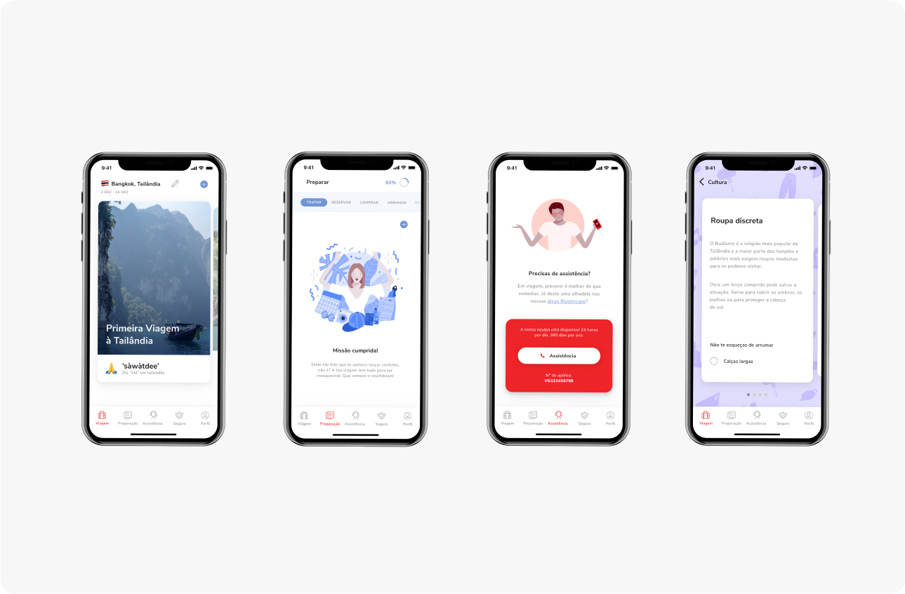
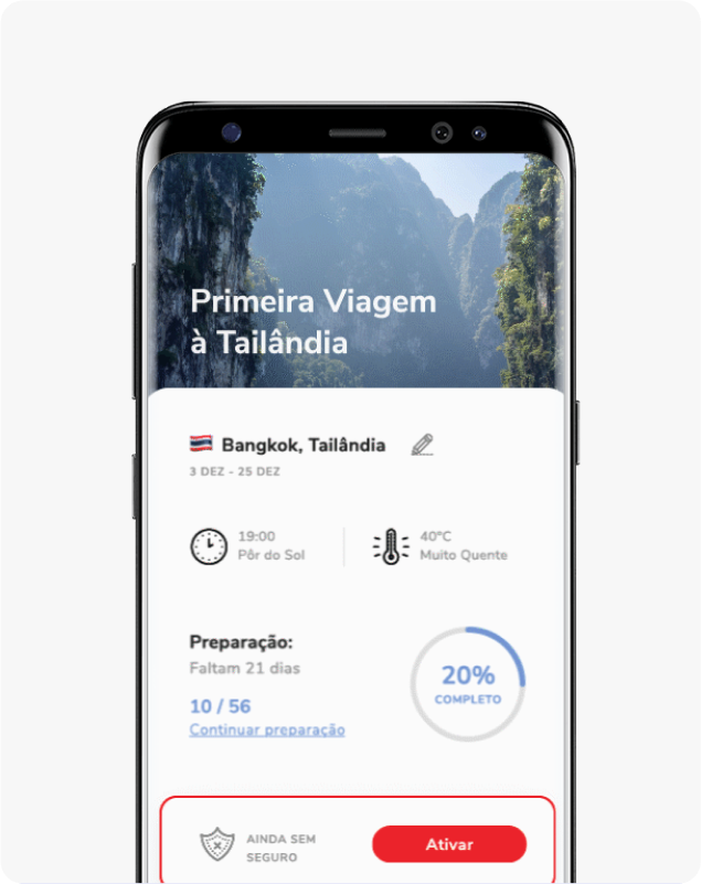
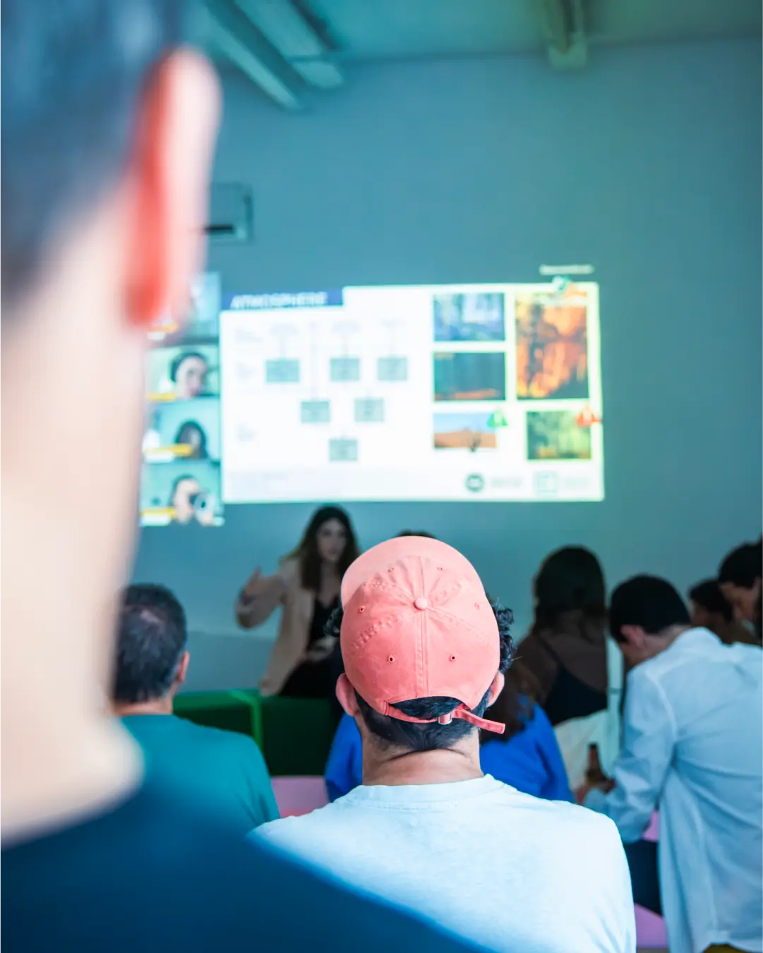
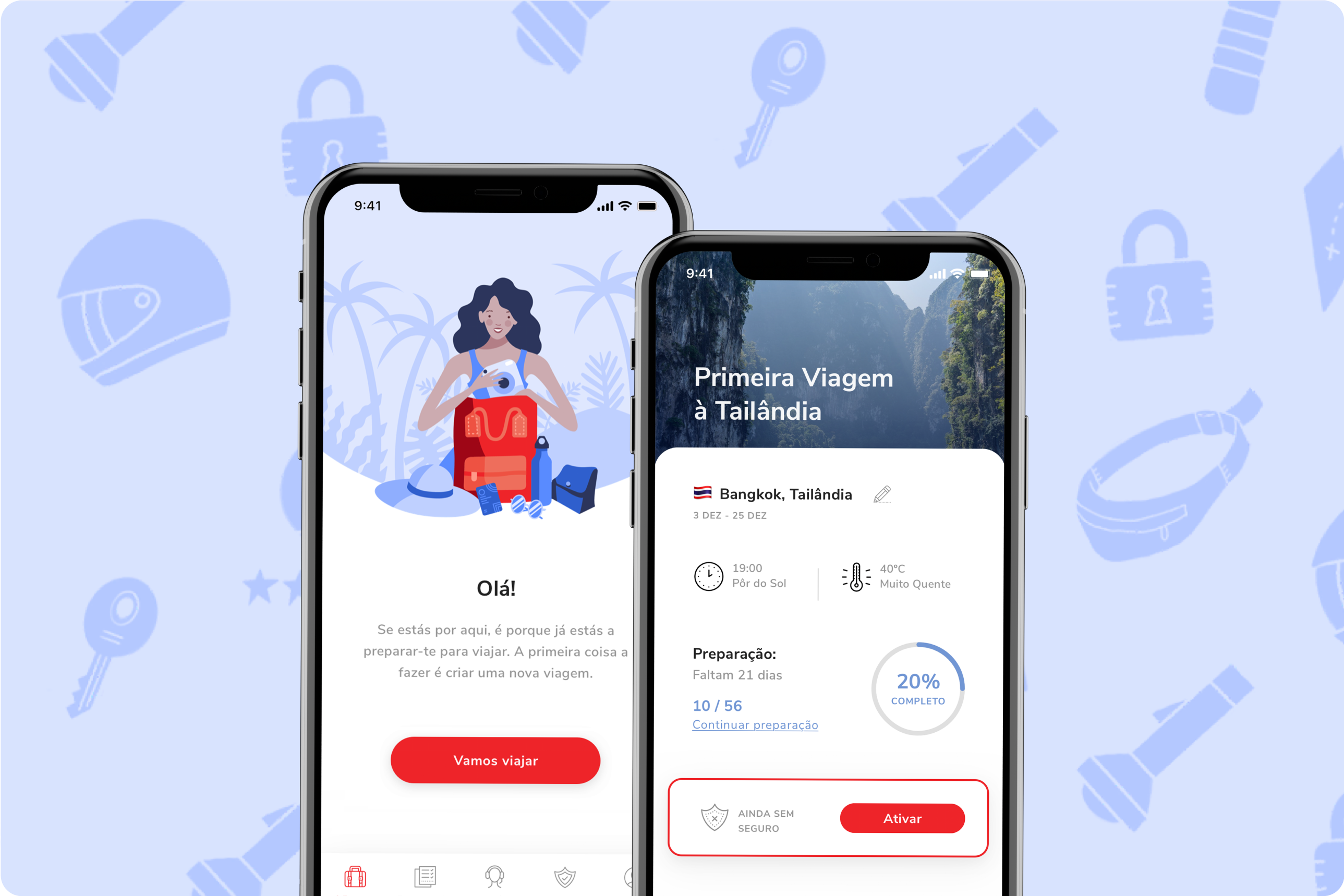
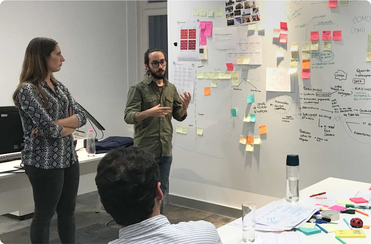
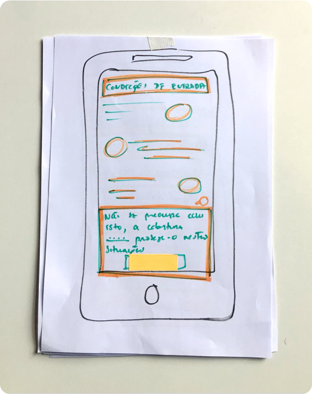
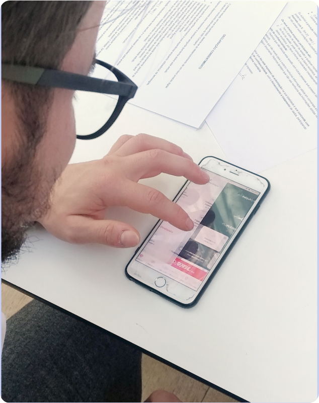
A full-day bootcamp with Fidelidade’s team facilitated knowledge sharing and co-creation, resulting in a travel app where on-demand insurance became one of several valuable features. We then developed and validated the “Just in Case” MVP, ensuring it aligned with user needs through a carefully designed UX/UI approach.
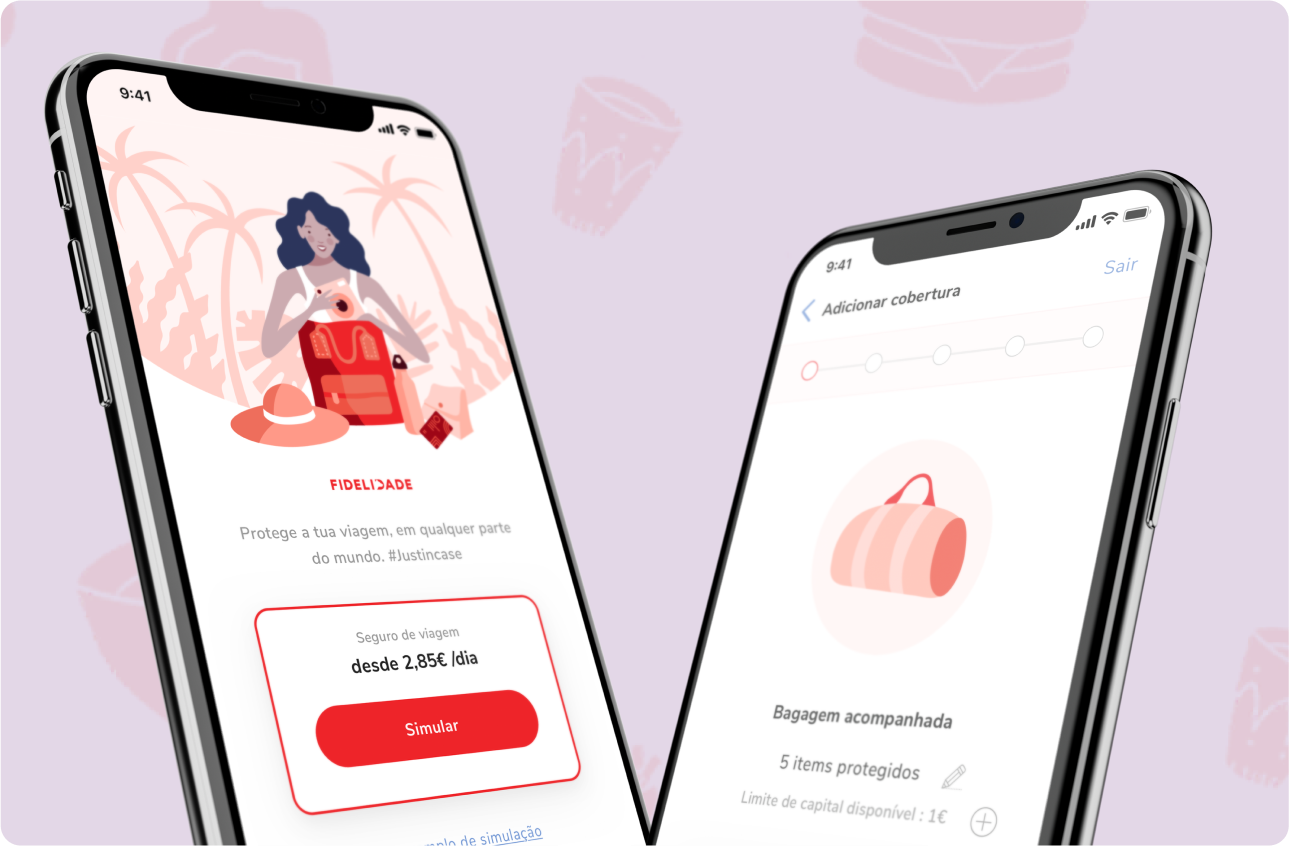
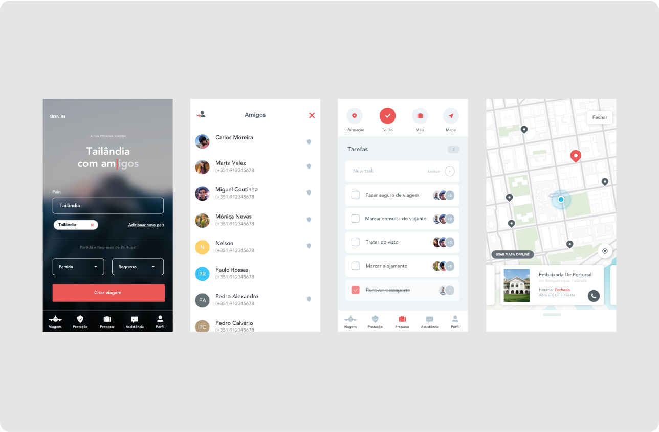
The final value proposition combined travel insurance with essential travel tools, providing travelers with security and convenience throughout their journey. To support its evolution, we created a roadmap prioritizing key features for launch while planning future enhancements to adapt to users’ changing travel behaviors.
Phase one
With 'Just in Case,' we reimagined on-demand insurance, integrating it into a travel app that enhances security and convenience for users. By aligning digital innovation with real-world needs, we delivered a validated MVP that reshapes how travelers engage with insurance - earning industry recognition in the process.
Phase two
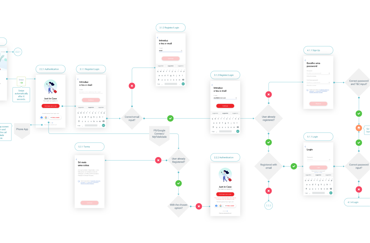
We set out to design an experience that helped sustain and transfer positive momentum from the consideration phase to the travel preparation phase.
Results and Impact
The Just in Case MVP was well received, both as a travel app and an innovative insurance product. In the first four months, it achieved 9,131 downloads and generated 946 insurance quotes. More than just a new way for Fidelidade to offer on-demand insurance, Just in Case became a valuable tool for travelers, seamlessly integrating insurance with essential travel services.
By prioritizing user needs and business viability, we created a solution that redefined how Portuguese travelers engage with insurance. The project’s impact was recognized with an Honourable Mention at the 2019 Portugal Digital Awards, highlighting its success in bridging digital innovation with real-world travel experiences.
