Making registry offices uncomplicated
Service Design,
Branding and
Contextual Research
With Instituto dos Registos e do Notariado (IRN)
Challenge
Rethink the way Portugal’s registry offices operate; creating a more efficient, autonomous, intuitive and standardised service. Consolidate the IRN naming and brand.
Outcome
A completely new service experience, with three adaptable layouts to fit all of Portugal’s IRN registry offices; a redesigned service architecture and customer-interaction prototypes, anticipating a digital transition. Plus a new brand, aligned with the new service experience.
- Client
- Instituto dos Registos e do Notariado (IRN)
- Service
- Service Design, Branding, Contextual Research
- Location
- Portugal
- Duration
- 7-8 months
- fields
- Strategy, Research, Brand Design, Space Design
- team
- Tiago Nunes, Maria Gomes,
Luís Medeiros
,Marta Baptista
,Francisco Dias
Ana Novais
,Andreia Baltazar
,Roberta Mansur
,Joana Brígido
,Toyno Studio
CONTEXT
Renewing your passport. Registering your own company. Filing for divorce. Actions like these always have one thing in common: Paperwork. Red tape. Bureaucracy. No one enjoys queueing and waiting for hours inside a stuffy civil registry office to get stuff done. In fact, sometimes we’re not even quite sure what we can or can’t do at these offices, or even what to call them — Registry? Registry office? Notary? Who knows?
However, given their importance, there are several moments throughout our lives where we simply cannot steer clear of them — for mundane reasons, good reasons, and bad reasons alike. So, what are the registry office’s main headaches for citizens? What are the main bottlenecks for civil workers? How can we turn the registry office into a more pleasant environment? And how can we set it up for an inevitable digital transformation? We were joined by Space Experience Design Studio Toyno and took a number to find out.
Our Role
01
Identify major bottlenecks by analysing citizens’ experiences
in registry offices
02
Define a solution for a more efficient and intuitive public service, that adapts to the ongoing digital transition
03
Simplify and consolidate the naming of the registry office, making it more recognisable among citizens
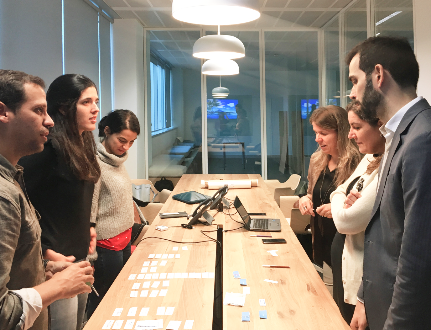
Ideation session
Experience mapping
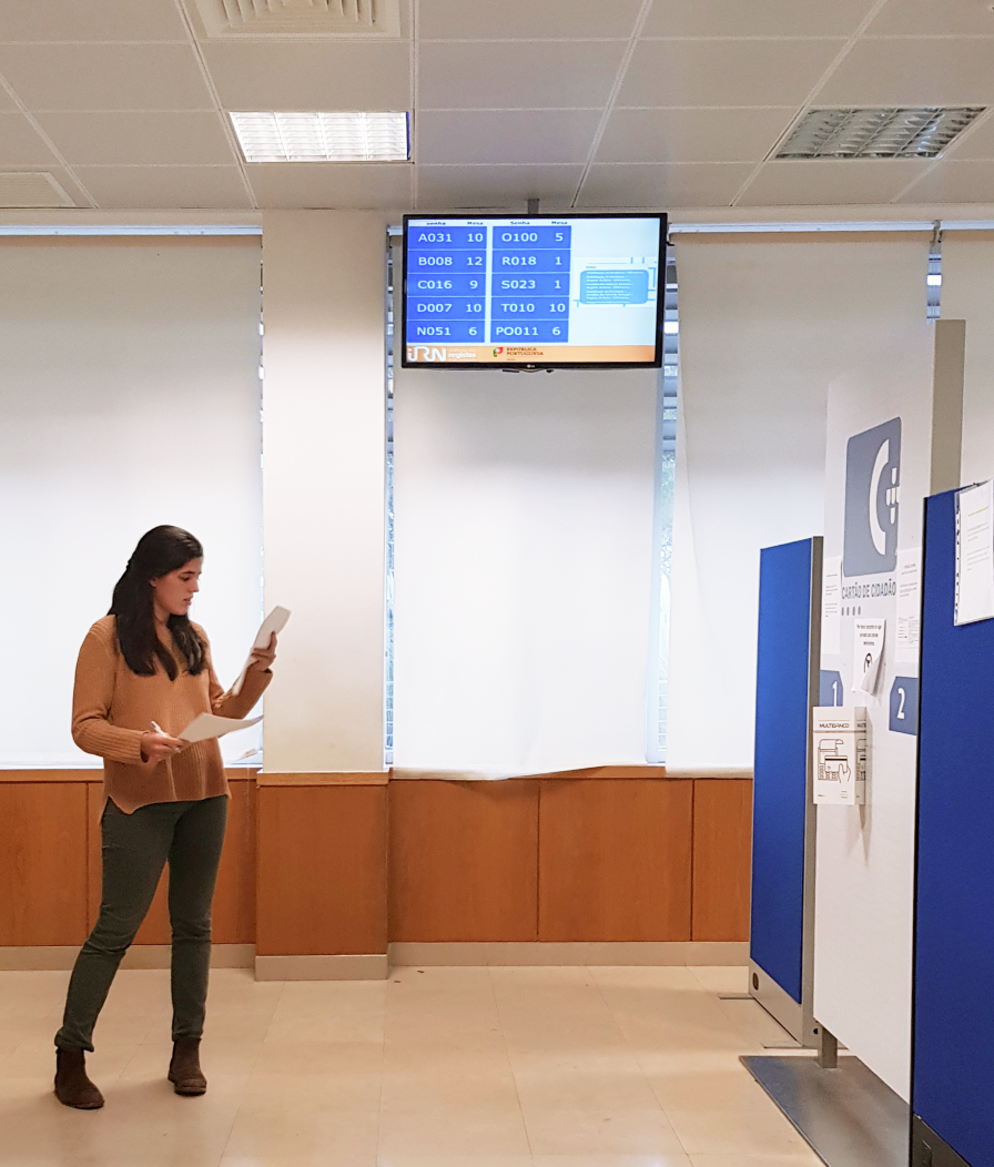
Physical surveys
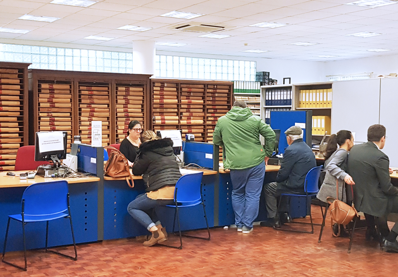
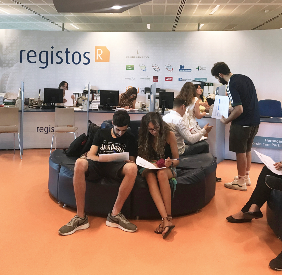
Field observation
RESEARCH
The registry experience has two main actors: public servants who work at IRN’s registry offices and citizens who seek these government services. To understand the perspectives and needs of these two different groups of people, a research phase combining both qualitative and quantitative methods were employed:
To map how different offices organised their back office and front office user flows, and observe how people interacted with the environment and public servants.
To understand the in loco perspectives of various degrees of users, from first-time customers to expert, long-time users.
We asked citizens about their past experiences in registry offices and requested them to project what this experience should be in a desirable future.
We analysed the popularity of the words “Conservatória” (conservatory), “IRN”, and “Registos” (registry), to find which term was the most consistently used.
We visited and studied spaces that have been designed to optimise customer service, like hospitals, telecommunication stores and fast-food restaurants.
Testing lo-fi signage and communication solutions in one office and surveying both public servants and customers waiting to be served at this registry office.
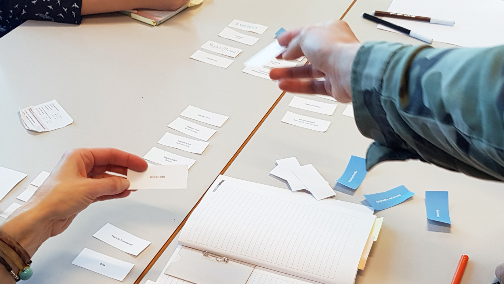
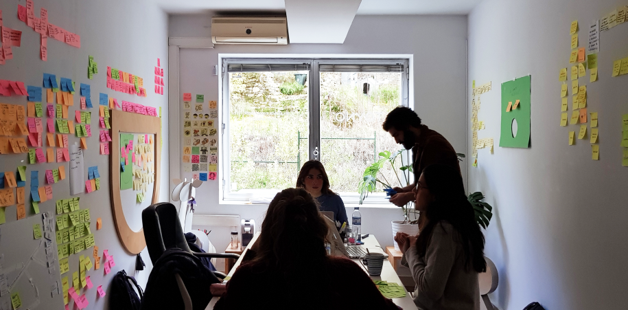
Co-creation workshop
7
Registry offices visited
385
Photographs taken
500
Kilometres driven
4
Surveys
6
Analogous spaces visited
2
Prototypes tested
2
Co-creation workshops
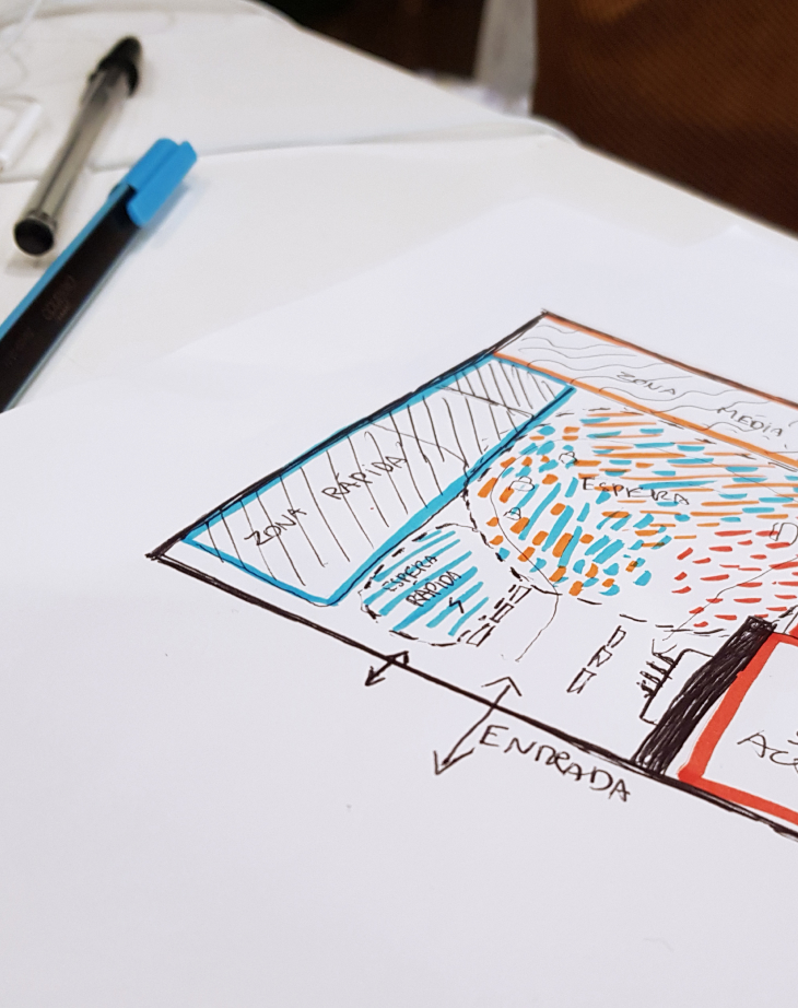
Space experience definition
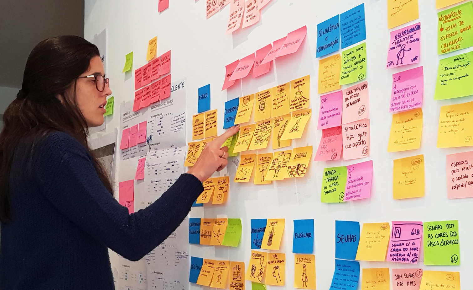
Space idea(s)tion
In the end, we identified ten major problems with the overall experience:
- Confusing take-a-number system.
- Inefficient/lack of booking appointments.
- Lack of service guidance and offer standardisation in different registry offices.
- Lack of information points.
- Lack of privacy, when dealing with sensitive matters.
- Uncomfortable and tiresome waiting time.
- Lack of resources and equipment in the offices.
- Overload of responsibilities of public servants.
- Lack of diversity and specialisation of services.
- Lack of expectation management concerning timings and efficiency.
While reflecting on these problems, we realised some required more effort to solve than others, and some were more impactful than others. For instance, updating signage and offering WiFi would have a big impact with little effort, while renovating these offices and increasing the workforce would require a lot more.
EXPERIENCE CONCEPT & DESIGN
All this research made us think. A trip to the registry office always represents something — an ordinary matter we have to resolve, a question that worries us and we want to see clarified, an important decision that we want to make official.
While these moments repeat themselves over time and have very different natures and levels of importance, they share a common characteristic: we all look for one thing when we go to the registry office. Whether that’s applying for citizenship or renewing our identity card; getting a simple certificate or opening our first business; officialising a marriage or filing for divorce.
A visit to the conservatory should always
be an uncomplicated moment.
User journey
With a newly defined concept, we began to think about what the registry office should feel like for citizens and public servants; the type of mood it should nurture. We knew it had to feel…
comfortable, intuitive, efficient, serious, reliable, safe, accessible, flexible and adjustable.
We took all of the research we conducted and added a touch of inspiration to design the ideal user journey, considering two non-physical starting points: online and on the phone:
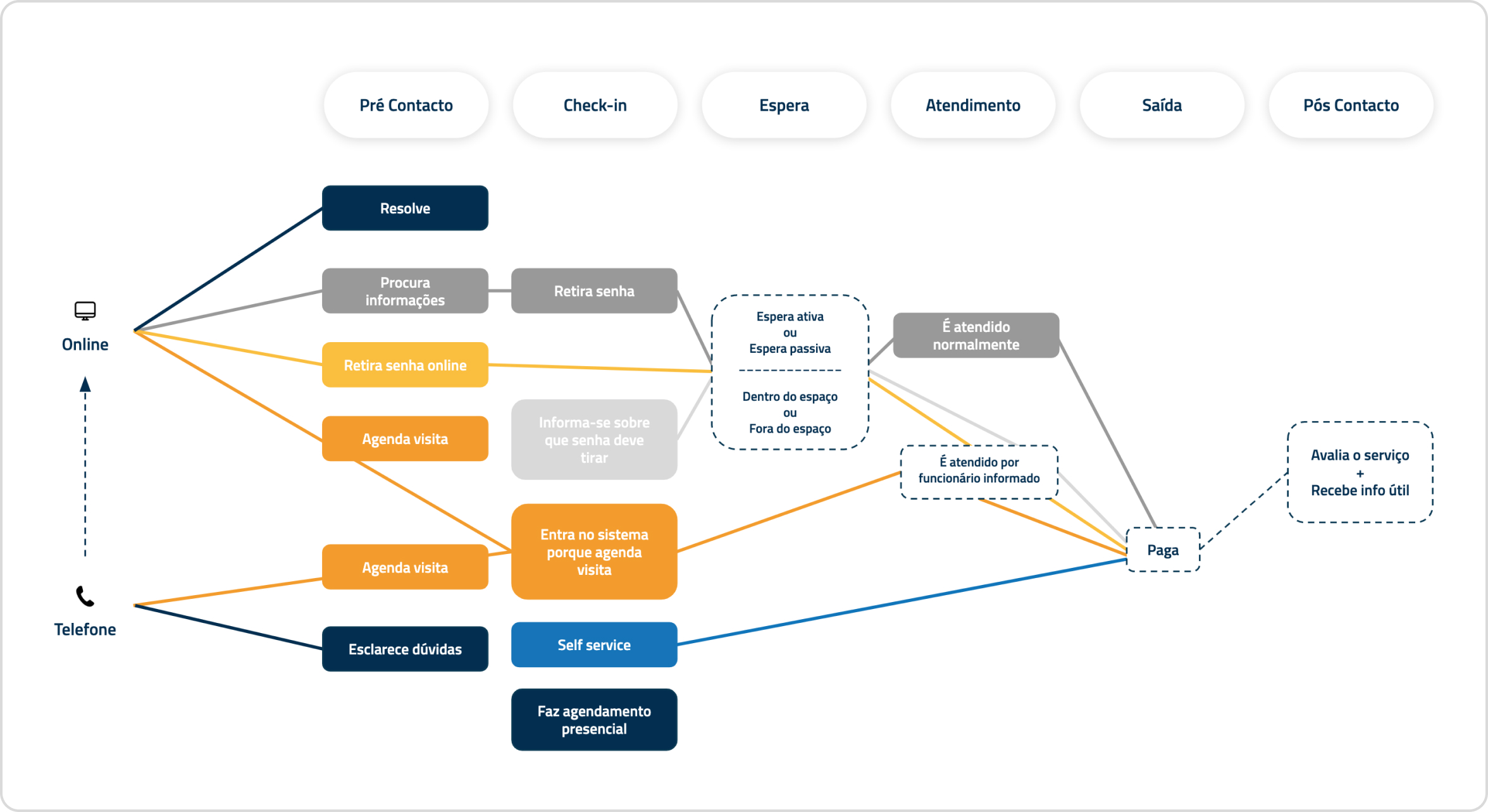
Ideal user journey
Services architecture
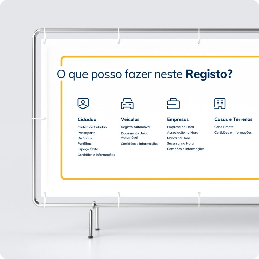
Knowing that service organisation was a big issue for customers, we re-organised the whole portfolio of services, breaking it down twice: into five groups according to the nature of the service — to facilitate the navigation of customers through the portfolio of services; and into three groups according to speed, required level of privacy and predicted emotional weight — factors that would influence the customer flow inside the space.
Customer flow mapping
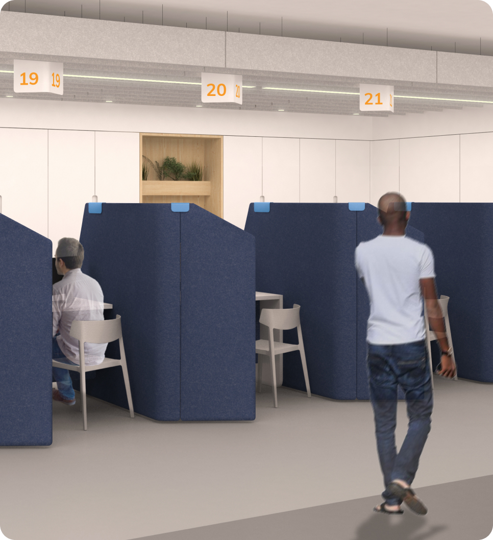
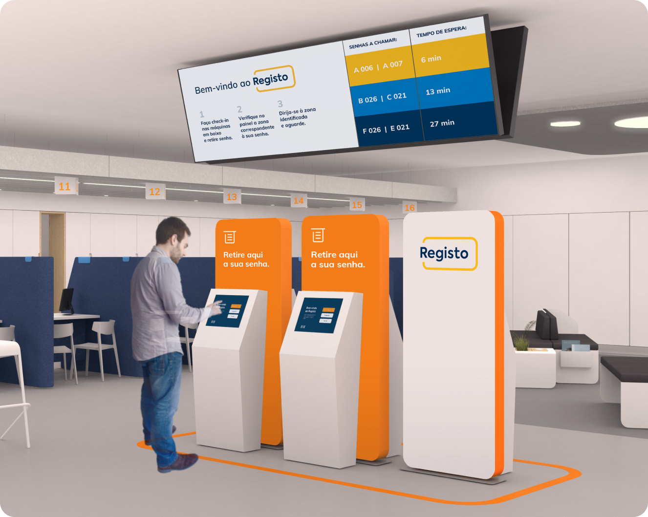
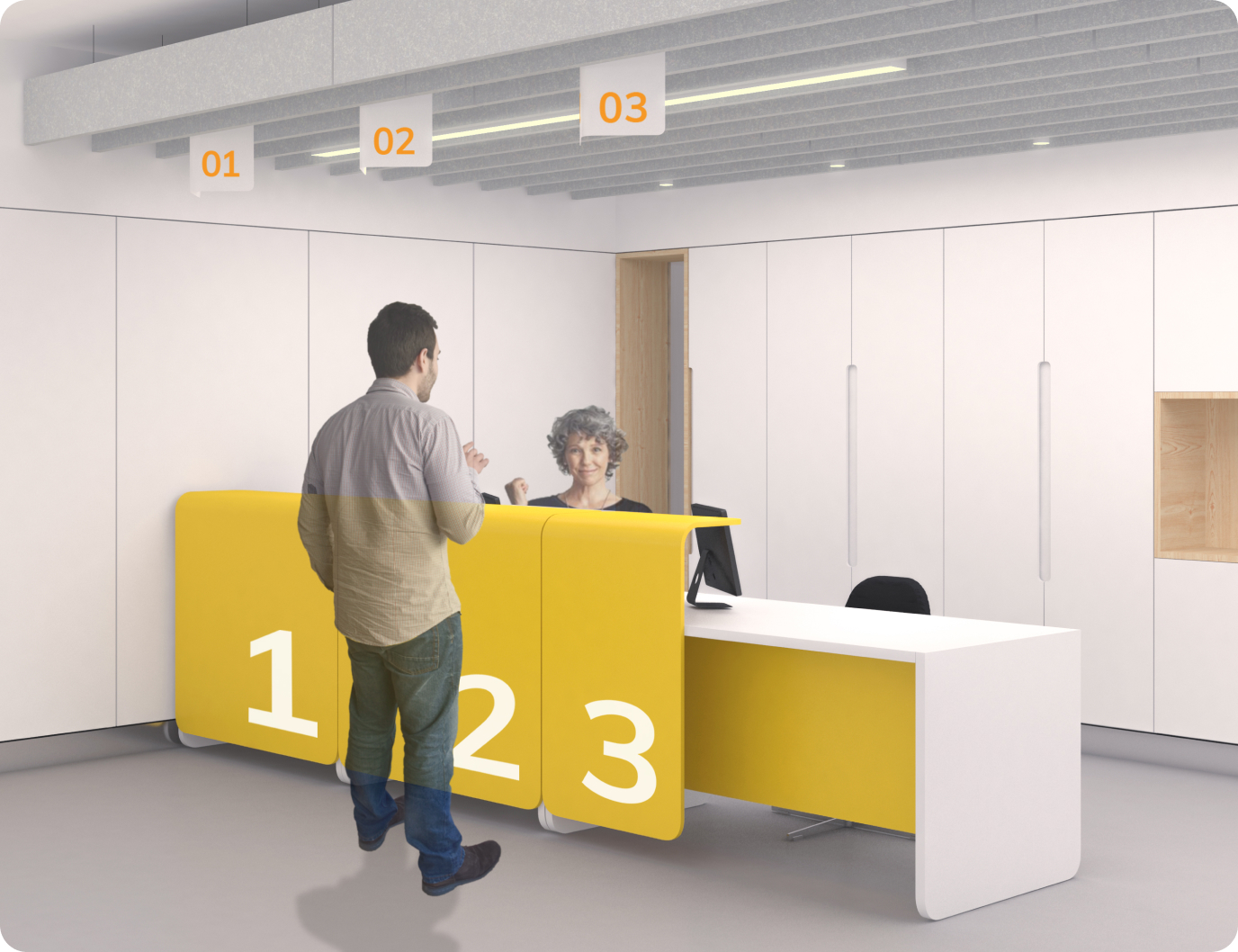
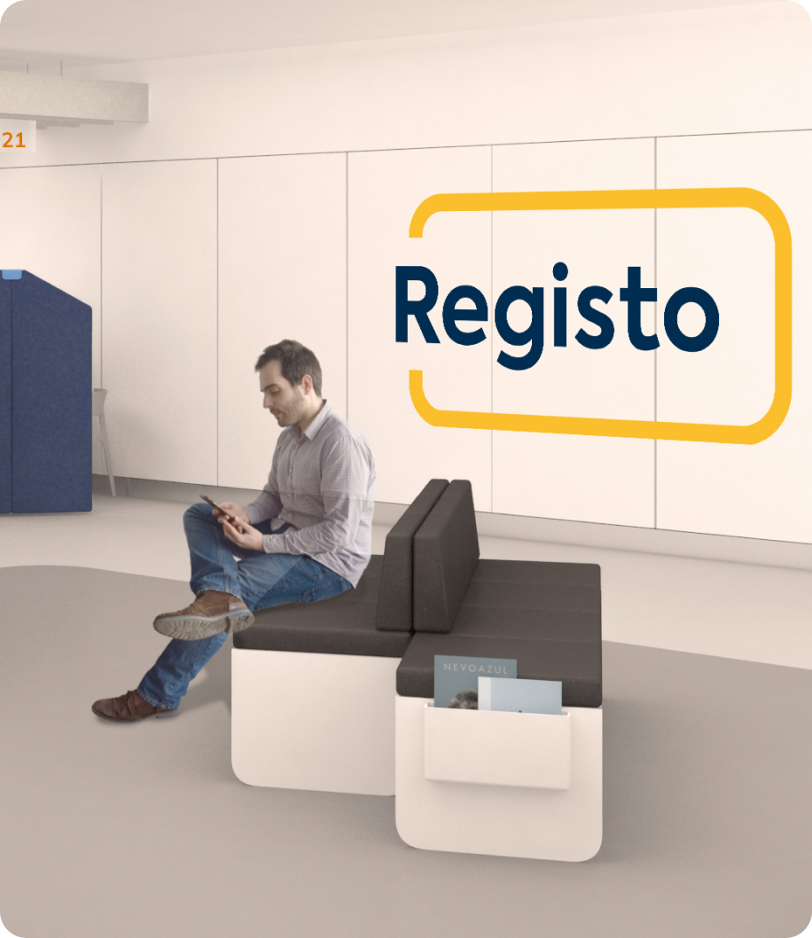
Based on these criteria, we came up with a space organisation model that was designed according to the speed and needs of the different services, with areas that stimulated different degrees of energy, privacy, seriousness, and formality: an open, didactic check-in area with guidance devices; a versatile waiting area that adapted to the needs of different customers; and three personalised service spaces for each speed and privacy tier.
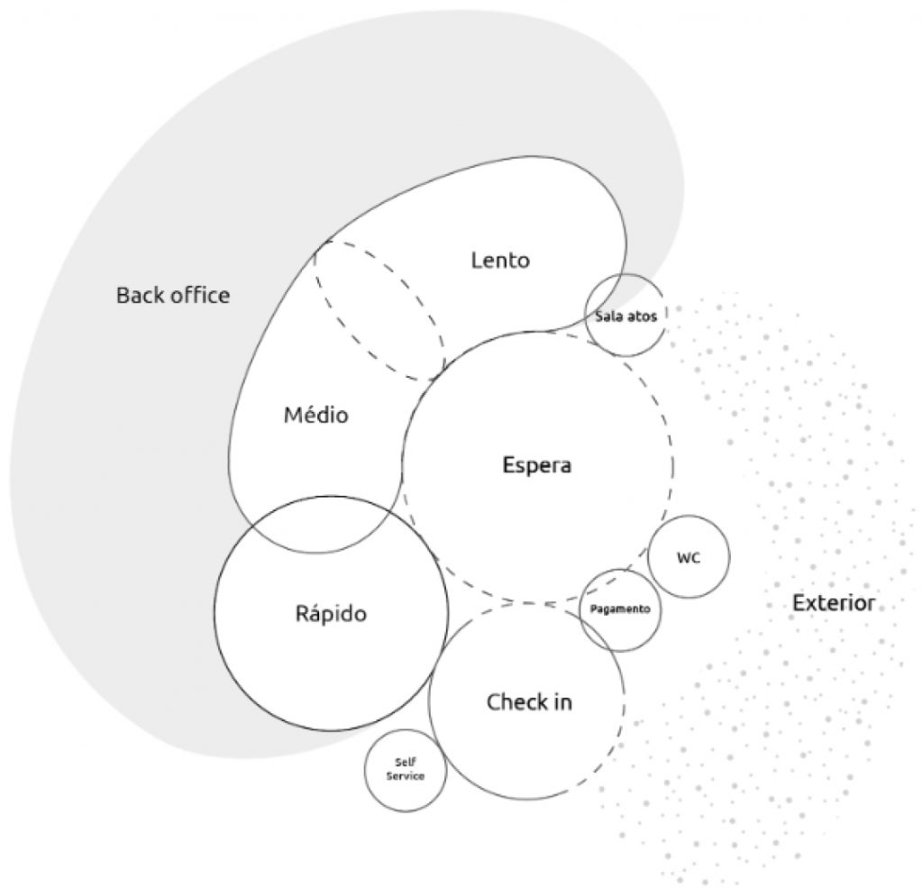
Journey experiences
With the ideal space organisation model in mind, we were able to present 15 different experience ideas that could be implemented to enhance the 6 moments of the user journey, including an online platform where customers could take a number online to decrease waiting time or pay for services; a digital check-in + self-service kiosk; a customisable room for important personal events, like weddings; a self-payment station.
NEW BRAND, NEW SPACE
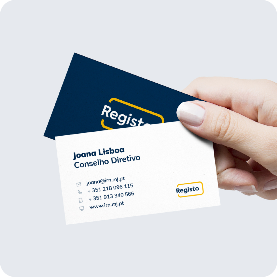
It was time to design a brand that could convey the updated characteristics of the registry experience, and inspire the design of new, uncomplicated offices. We had previously decided that “Registos” was the best strategic path — but was it the best brand? We applied our concept to this naming and decided to uncomplicate it by dropping the last “s”.
“Registo” is not only easier to pronounce, but it is also a verb, on the first person singular, representing a new phase of customer empowerment — enhanced by digitisation — pursued by IRN.
We deconstructed the IRN logo, keeping the original “line of life” concept of the previous logo, but making it flatter and simpler.


Based on the space organisation models, Toyno designed floor plans for each registry office, considering three different types of sizes: big (up to 16 counters), medium (up to 10 counters), and small (up to 4 counters). That way, we could control the energy of each space, regardless of their size.
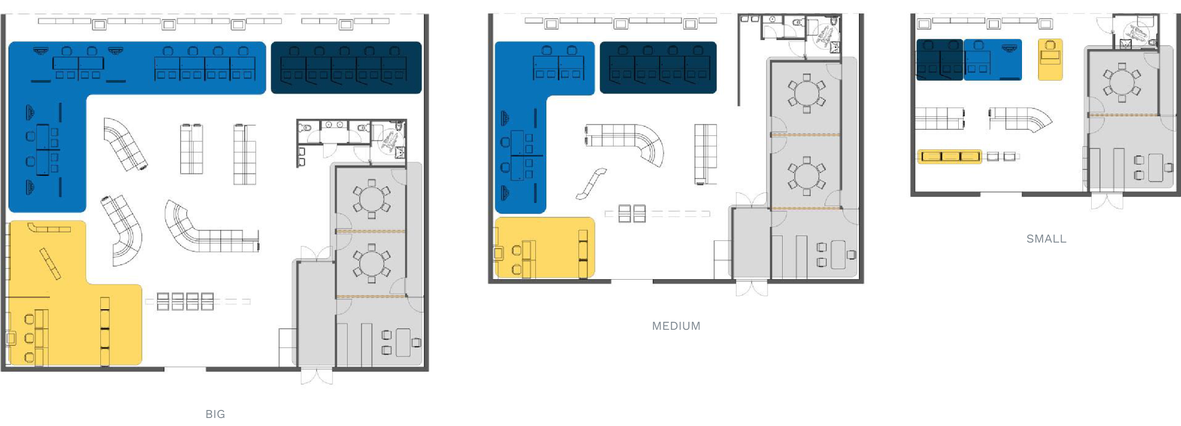
In the end, we delivered an adaptable solution where our “uncomplicated moment” concept remains true, no matter the scale:
-
An intuitive space that changes the waiting time experience and increases the efficiency of the service
-
Resistant, flexible, and inclusive
-
A space that fits different needs: services, communication, and size
- A new service experience, which nurtures more positive behaviours from customers and public servants alike
Results
-
A “store handbook” that guides IRN through the application of this new concept to any of their offices across Portugal
-
A pilot prototype, which is currently being implemented in 3 different registry offices
-
A new brand, which is already showing up in several user touchpoints, such as Facebook or LinkedIn
- One registry office in the centre of Lisbon is starting to rearrange the space and applying the new brand


